


We love featuring remarkable artists whose work inspires us. One such artist who caught our attention is Casey Robertson, a talented illustrator with a distinct focus on our little genre within the cycling industry. Our initial encounter with Casey's work was through the logo of the Farther Bag Co. (interview here), which left an indelible impression on us. Among a sea of homemade logos, it was evident that Farther's brand was crafted by a pro. Little did we know that this was just the beginning of our journey into Casey's world.
Casey's artwork has this incredible ability to transport us back to the good ol' days when BMXs were the ride of choice and comic books were the ultimate escape. It's like taking a nostalgic trip down memory lane but fused with modern cycling hotness. With straightforward vector visuals and a touch of halftone magic, Casey's illustrations exude a sense of authenticity that's hard to resist.


How did you get started as an illustrator?
I'd worked for various firms/agencies/shithouses early in my career. While I do enjoy logo design, I find that most logos are the hard-fought result of being hyper-particular about unimportant things; a forest-vs-the-trees situation. Illustration has been a way for me to flex harder on the creative side, and help establish some feeling within a brand. Now, here I am three or so sentences later and I haven't quite answered the question. I got started out of necessity. I'm uneducated, unfit for typical work environments, and restless AF. I've always used drawing to connect with an experience, calm down, and explore.
I'm uneducated, unfit for typical work environments, and restless AF. I've always used drawing to connect with an experience, calm down, and explore.
How long have you been drawing?
Like riding a bicycle, I've been drawing since childhood. There was a period in my young adulthood where I explored other means of visual creativity: tattooing, graffiti, sign lettering, and more, but the purest fun for me has always been quiet moments with the sound of a pencil or pen on paper.

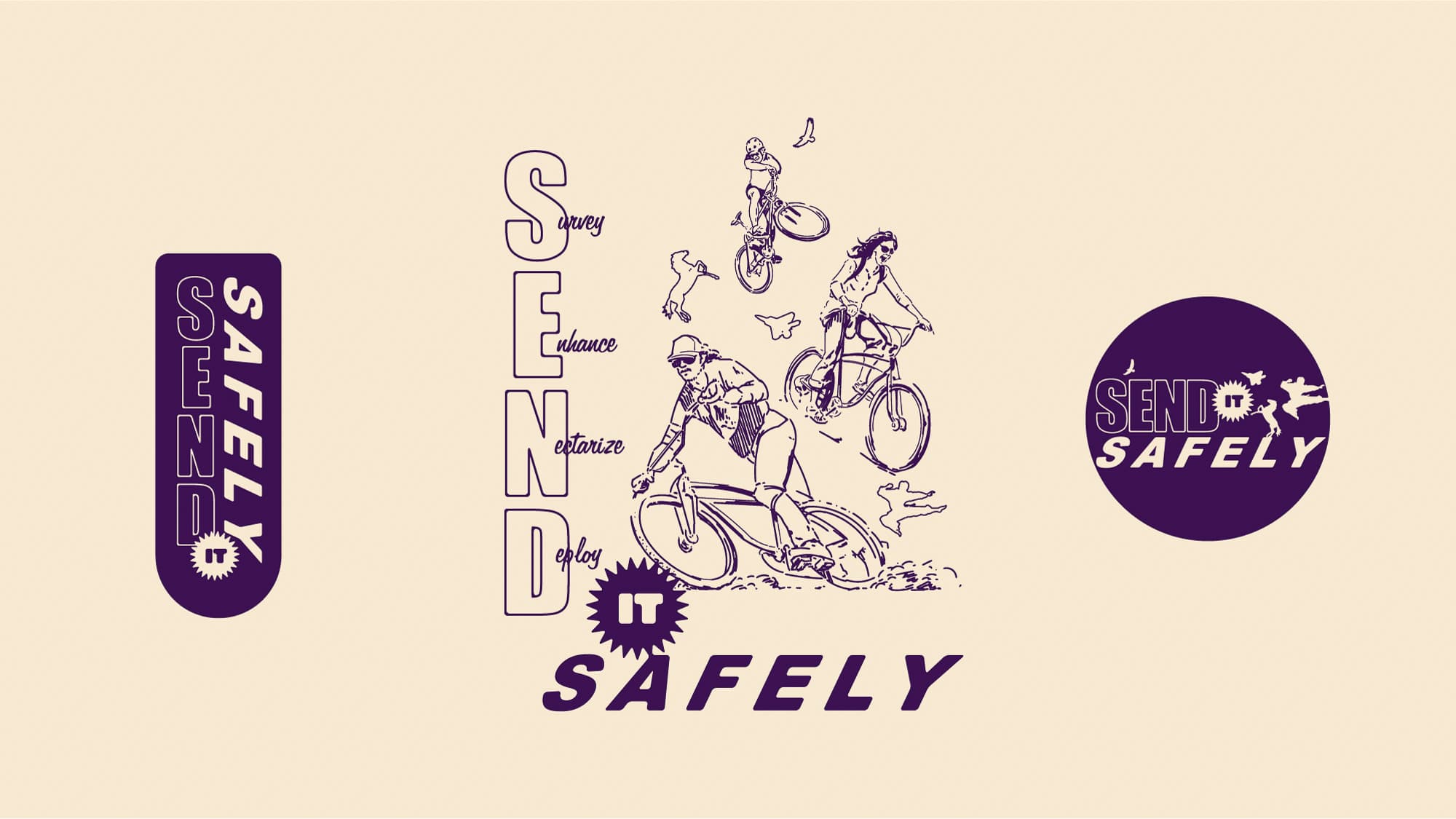
Is there a name for your style?
I call it DustTech™, because of the antiquated halftone patterns I employ, but the end result of my work is all digital, which actually makes it super high-tech. I'm not aware of being a part of a larger school, per se. The thing I really like about the DustTech™ look is offering some familiarity and nostalgia along with what I'm illustrating. In the digital world, we don't get to hold much paper, but I think sneaking it in visually is something worthwhile.
Who exactly is Champagne Rodman?
I was offered a contract opportunity for a large cycling publication to cover the 2015 UCI Worlds in Richmond, VA. On a lark, I used a nom de plume, which kind of helped me ratchet up the level of audacity with the work. It was an effective play for me, and I've come to enjoy the layer of separation between my public and private self. An alter ego can work wonders for confidence levels.


What does your process look like?
My process is rarely the same. For commercial work, I have an intake process and I get to know new clients as well as I can. Talking, communicating, and sharing images of things that get us hyped. That sort of thing. Music is also a great connector, so I like a client to let me know what sort of music might be playing when they close their eyes and imagine something awesome. But as for the actual creating things side—my brain is a catalog. If I don't know what something looks like, I know where to find it. I remember so many graphic artifacts from my life. My eyes are open all the time and my brain feeds on details, fonts, alignment, space, shape, texture, tone, and more. Give me all the details so I can figure out which ones to throw away. Based on the frequency we're trying to hit on a project, I'm going to refer to cataloged visual experiences that I feel will guide us there. Maybe a dude has action lines, maybe a car is arched back while the tires squeal, or maybe it's a dead-eyed fish in perfect side profile vibing you with stoic indifference. The Champagne Catalogs will lead me there.
My eyes are open all the time and my brain feeds on details, fonts, alignment, space, shape, texture, tone, and more.
What software do you use?
I have established a pretty solid work pipeline for myself which is Illustrator first, Photoshop if necessary. The halftone patterns and old paper are in Photoshop, and the illustrative components happen in Illustrator.

How does the cycling work find you?
The cycling work is my bread and butter, and I'm so grateful for it. Being able to generate a living in an industry so close to my heart definitely fulfills the adage about liking what you do so it won't be work. Additionally, contributing to the visual lexicon of something that has influenced me so greatly—that's a deep honor, and I don't take it lightly.
You've had some awesome clients... who’s missing?
Thank you for that! I really have. I feel like when the work is done, I come away with a new friend(s), so again - what a treat. Who's missing? Ha - we're all missing, man. Where am I, even? Anyone who's down to clown. Better ring me up via my website or on Instagram.


